Superior Flyer Design
Posted on August 5th, 2015 by Mark Hayden | Categories: Marketing & ZipTips

Sometimes the easiest way to make a superior flyer design is to use one of our Superior layouts. This article features samples from the Superior flyer design. Note that all the listed designs feature excellent use of color themes (Especially June), which are provided along with the sample superior flyer design of each month.
May Superior Flyer
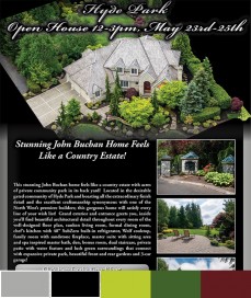
A Superior Flyer Design from May 2015
May is a truly unique superior flyer design, thanks in large part to its main photo. The perspective and “cut-away” effect on the terrain is suggestive of a small, highly-detailed diorama. The main image is also strong because of the way it “pops” against the background, thanks to the high contrast between the saturated green colors of the foliage and the relatively unsaturated gray shades of the house. The rest of the flyer is largely standard fare, but the main image draws the eye and is truly outstanding.
June Superior Flyer
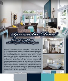
A Superior Flyer Design from June 2015
June’s flyer is a great example of a color theme. This layout features our default Superior-Gray design, but what makes this design special are the photos that the agent provided. A neat kind of complementary coloring emerges, as the slate gray of the flyer goes well with the blues in several of the room pictures. The dark blue trim along the bottom of the flyer interacts well with the darker blues and browns in the image, and there is a neat play of yellow seen on several pillows in the pictures.
July Superior Flyer
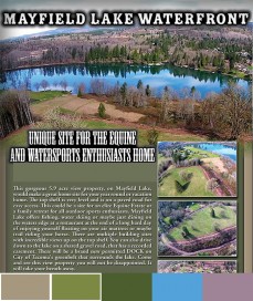
A Superior Flyer Design from July 2015
July is special in that it features a custom font. Sometimes what is really needed to make a superior flyer design “pop” is a custom font or two. In this case, the property is a listing out in the American west, and the agent wanted to convey a that sentiment with the design. With relative ease, our designers were able to change out the header fonts, converting the normal script into the wood-carved façade of yesteryear. While much of the flyer is unaltered, this simple change helps give the Superior flyer design a “wild west” feel appropriate to the listing.