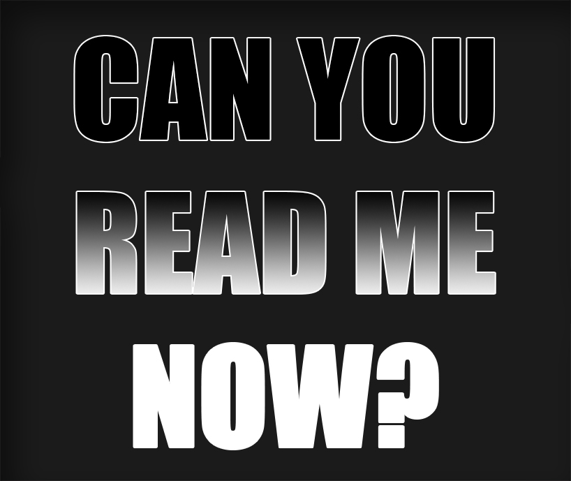
ZipTip – Can You Read This E-Flyer?
Posted on December 7th, 2015 by Mark Hayden | Categories: Marketing & ZipTips
E-Flyer Legibility is Critical:
You already have very limited space with which to convey your written thoughts on the property you are selling, and it’s a shame when this important information is lost to difficult-to-read formatting. While our in-house design team is well-versed at ensuring the legibility of the flyers we work on, some of the custom orders we receive can be lacking. So, what can be done to make sure your custom e-flyer is the most legible it can be?
-
Pick a legible font.
Not all fonts are created equally when it comes to legibility. Script fonts are particularly difficult to work with at the smaller sizes commonly used in body text. Script fonts are best suited for headers and sub-headers, just remember to keep them especially large and legible. The best fonts to use in body text are block letters, and a variety will work well. Just remember…
-
Pick a suitable font size.
Some fonts do work better than others when reduced in size, but any font will become illegible when made small enough. Keep in mind that custom e-flyer images are often shrunk as part of the process of encoding them in HTML. Use fonts that are a little bigger; it might look a little too large when the flyer is being made. Keep in mind that if a hypothetical custom e-flyer image arrives to us at 2720×3250, it will be converted to 680×813, roughly 1/16th its original size. You can then imagine what this will do to font size.
-
Pick a suitable font color.
Font color is critical to legibility. If you have a dark font against a dark background, or a light font against a light background, it can often have a strong impact on readability. Try to use blacks, whites and yellows for font color, depending upon if a background is light (use black) or dark (use white or yellows).
Remember: you put forth a lot of effort to get this custom e-flyer out there. Make sure your audience can read it!
For our latest promotions and samples, check our facebook or twitter pages!