Posted on October 17th, 2017 by Caitlin Thornburg | Categories: Marketing & ZipTips
When you get a listing, there are so many things to do! You must get it into the MLS, you have to write about the house, you need to take pictures, put up signs, get it syndicated online all over the place, make flyers, put it up on your website, get a virtual tour created, schedule open houses, decide whether to advertise it in the paper or magazines or online…
When you look back at listings you’ve sold in the past you probably wouldn’t be able to credit just one of your activities as THE reason your listing sold. Maybe one had great pictures, another had a terrific open house or maybe someone just drove by and saw it… so many variables to consider when evaluating what works.
But there is always one reason that stays the same – a Selling Agent showed your listing to the buyer. E-Flyers are a terrific way to be sure other agents know about your listing. Of course, most good agents review new listings as they come up on the MLS. Maybe the agent with your perfect buyer doesn’t review new listings regularly, or your listing’s main photo didn’t grab them, or your listing was slightly out of their search parameters. There are so many reasons for your listing to accidentally get passed by and excluded from their searches, while it might be just what their buyer is looking for.
Sending an E-flyer presents your listing to other agents the way you want it to be seen. Maybe the brand-new kitchen should be the focus, or a terrific view or the large yard. E-flyers let you showcase the best features of your listing and grab the attention of other agents.
Choosing the right E-flyer Company then becomes the challenge. There are many questions to consider to really be sure you are getting what you pay for and that you are represented in a professional way to your fellow agents. As the nationwide leader in real estate E-flyers, sending millions of E-flyers per day, we want to share some valuable tips and resources with the real estate community. As an agent-founded business, we understand the needs of agents and we set out to prove what we already knew… E-flyers do work! We took 6 major cities across the nation in a given time period and found that properties marketed by Zip Your Flyer showed 22% fewer days on market. This is key, getting out there in front of other agents matters!
Make sure you determine which pricing model is right for you. Do you want to join a model where you pay a monthly fee or commit to purchasing a certain number of email flyers throughout the year? Agents pay monthly for so many products, Zip Your Flyer feels that E-flyers should truly be a service you only pay for when you have a listing and whenever you need an E-flyer.
Customer Service is a phrase that gets used a lot. It is always refreshing to be connected to a Customer Service Representative right away. Doesn’t happen too much these days. It should be easy to call a company and get quick answers to your questions or concerns. Real customer service, and real designers are an integral part of your experience to ensure your professionalism is carried through in your marketing.
With the right company, E-flyers are a professional way to get your listing out in front of agents.
Posted on August 15th, 2016 by Mark Hayden | Categories: Marketing & ZipTips
It costs less than $50 to email one of our e-flyers to a list of 5,000 agents. Does that sound like a lot? Let’s look at the numbers!
 E-Flyer Pricing Matters! When a customer purchases one of our e-flyers, we send it out to one or more of our regional lists. Lists composed exclusively of interested real estate professionals! To ensure that our lists remain effective, we make sure to keep them trimmed of agents who do not open e-mails from us for more than six months. We also gladly remove any parties who do not wish to receive our e-flyers, which not only keeps us in compliance with the CAN-SPAM act of 2003*, but benefits you by removing agents uninterested in receiving our e-flyers. This keeps our prices low by reducing the “bloat” of uninterested parties.
Say a given list has 5,000 agents; of those, we guarantee that at least 10% of those will open a given e-flyer. This might not sound like a lot, but as e-flyers go, it’s a solid number! At this point, usually about 10-15% of the agents who received the flyer have opened it, so about 500-800 agents have now seen the flyer. Based on that open rate alone, 650 agents would see that the $50 flyer; this works out to about $.07 cents per agent who opened the flyer!
ZipYourFlyer.com also includes flyer design in its e-flyer prices, and we offer a choice of any of our superb design schemes! All a customer has to do is upload text, pictures, contact info and property info. Within a few hours one of our skilled designers (maybe even yours truly) will send a proof for approval. After the client makes revisions, one of our specialists will send the e-flyer to the specified area. Some companies would probably charge $50 dollars for the flyer alone, without even offering the ability to send it out!
I may be biased, having made a few thousand of these e-flyers in my time here at ZYF, I can speak for the process. Maybe it’s the Stockholm syndrome, but I love the job I do, and I think it’s reflected in the quality of the work I put out. And yes, my dedication to making an excellent product comes standard and at no extra cost; no matter if it’s a no-frills Simple design, or one of our more flowery offerings like Claret or Rustic.
ZYF offers a great products, good prices, and I’m more than happy to work on your next order! To see some samples of our final products, check out our Facebook and Twitter pages!
*The Federally enforced law which sets standards for sending of commercial e-mail.
Posted on August 3rd, 2016 by Mark Hayden | Categories: Marketing & ZipTips
Who Owns your E-Flyer Images?
With the advent of the internet, it has become ever-easier to get information to help your customers sell their listings. Whether using the MLS, hosting virtual tours, or even sending an e-flyer with ZipYourFlyer.com, the internet makes it easier than ever to do the work of selling homes. But with all this ease, there is an important consideration:
You might not own the images you want to use to market your listing or service.
Online search engines can yield thousands of thematic images or pictures of homes for the use of your e-flyer. Some of these are open source images, free for anyone to use for any purpose, even selling a house. Some images are available through purchase, usually through stock sites or from individual photographers or artists. Images can even be free for non-commercial use, but require purchase for commercial reasons. Still others are completely unavailable for commercial use and purchase, and are the exclusive property of their owner.
It is important to remember that you are responsible for the images that appear on the advertisements you use!
As technology has increasingly lowered the barrier of access to artists and especially their work, it has also helped to facilitate the ease in access to legal services. While it is easy to write off a designer or artist as a faceless entity whose art you can simply pilfer at your whim for your own use, these same artists and designers are becoming increasingly savvy when it comes to protecting their rights and property. Particularly judicious artists and designers can and even will employ attorneys to protect especially treasured assets.
ZYF does its part to protect the interests of third party artists by stipulating in our terms and conditions that our customers must own or have permission to use the images they provide to us. ZYF refuses to use watermarked images on any of our e-flyer designs without the permission of the producing artist.
Please remember to check our facebook or twitter pages for our latest promotions and samples! ALSO remember, you can subscribe for free to be the first to know of New Listings, Broker’s Opens, Special Agent Commissions… and much more in your area.
Posted on July 19th, 2016 by Mark Hayden | Categories: Marketing & ZipTips
Ensure Your Future E-Flyer Orders Are Ready On Time!
 Hello, ZYF E-Mail Deliverability Specialist Aaron L’Heureux (“La-Roo”) here once again to give you some helpful e-marketing advice. Today I want to show you the best ways to ensure your time sensitive listings can be delivered punctually.
The Single Best Way To Ensure Timely Delivery Is To Order Early.
Above any other advice I can give you, get your order in as soon as possible! Even a couple days or weeks aren’t too early, as you have the ability to schedule a later release date. One of the most glaring errors some of our open house customers can make is to try place an order late on the day before their open. Building a flyer takes time, and turnaround of a flyer depends on customer approval. Without customer approval we can’t send. Speaking of approval…
Approve On Time!
While ZYF can set up its systems to send future e-flyer orders anytime after the order is approved for delivery, we are only available to process your approval between the hours of 6:30am and 3pm. If you are trying to approve an order for delivery the day before your open house, it is important that your approval is in before 3:00pm! Otherwise, we won’t be able to set up your order on time for sending the following day.
Make Sure Your Order Is Correct Before You Hit That Approved Button.
Carefully reviewing a flyer only takes a few minutes, and any revisions your approval might require do not take long. However, some agents skip the review process altogether and simply approve, only to view the flyer later on and notice changes that should have been made before the flyer was sent out. Fixing these mistakes times extra time and effort, and could hinder the sale of the listing.
Posted on July 11th, 2016 by Mark Hayden | Categories: Marketing & ZipTips
I strongly suggested that agents avoid using abbreviations when composing the body text of your e-flyer. I’ll use this article to cover a few additional tips to help make your e-flyer the best it can be!
Pursuant to our last entry, we’ve already emphasized the “quality over quantity” approach: avoiding abbreviations, and making sure that while a full body of text is provided, that it is not of such a quantity that our designers are forced to shrink the font for the sake of fitting everything in at the cost of legibility. This of course raises the question: “Is there enough room for everything?” No, but you don’t need to list everything either. Consider using your e-flyer as a tangible source of truly interesting information. Use your e-flyer to show the best and leave the rest to linked listing websites or virtual tours using our convenient weblink functionality built right into your e-flyer. This technology allows you to link up to two tour or listing websites, in addition to a third weblink for your brokerage.
In addition to the key items (bedrooms, bathrooms, square footage, all of which only takes up about a sentence) be sure to use your limited space to talk about truly unique features of the property. Remember the importance of location (location, location!) and tell your audience about what makes the location special and unique. Tell them about the curb appeal of the property, pools, landscaping, casitas, lanais and so on. Tell your audience about the rich hard wood floors, study doors, formal living area, solariums.
Perhaps the single most important thing to do is the record all of these important features while you wander through your listing. Write, record or photograph as much as you can when you visit the house. A busy real estate agent such as yourself will never memorize every little detail without a little help, especially if you are listing more than one property.
Please remember to check our facebook or twitter pages for our latest promotions and samples! ALSO remember, you can subscribe for free to be the first to know of New Listings, Broker’s Opens, Special Agent Commissions… and much more in your area.
Posted on June 27th, 2016 by Mark Hayden | Categories: Marketing & ZipTips
A SET OF BIG, BOLD CAPITAL LETTERS WILL GRAB THE ATTENTION OF YOUR AUDIENCE.
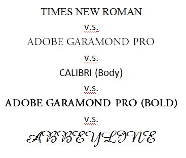
Many of our most popular e-flyers feature “script” or “cursive” typefaces meant to represent ornate handwriting. While appealing to the eye, script typefaces are often meant to be used in the lowercase, while the uppercase lettering is larger and more ornate and meant to be used at the front of words, rather than throughout. The decision to use script fonts is a fine one, and the fonts we use are generally quite legible, but keep in mind the limited ability of these fonts to be used with capital letters.
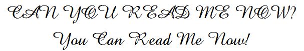
If your script font does end up in all caps, one of our designers will often change it to another suitable font to ensure legibility. Typically when I make this kind of change I strongly favor the use of one of the Adobe Garamond Pro fonts. These fonts are great because of their versatility and ease of use across a wide variety of formats and styles. See a few examples below.
BUT IF EVERY THING IS CAPITALIZED, THE EFFECT IS LOST!
Every day our design team sees at least a few flyers which exclusively use capital lettering. The danger in this is that the emphasis is lost. A flyer is a short document, in the case of our flyers usually a little less than a page of information. To attempt to emphasize the entire document by using capital lettering is therefore self-defeating: because the whole of the document is visible at a glance, and all the text appears similar, albeit in capital lettering. Switching between the two styles can be far more effective.
Please remember to check our facebook or twitter pages for our latest promotions and samples! ALSO remember, you can subscribe for free to be the first to know of New Listings, Broker’s Opens, Special Agent Commissions… and much more in your area.
Posted on June 27th, 2016 by Mark Hayden | Categories: Marketing & ZipTips
“What can I do to Create Effective Real Estate Flyers?”
Of all the materials our clients submit to us in the e-flyer creation process, one of the most critical is also one of the most banal: the body text or summary. This is a part of e-flyer creation that is easy to overlook and can be difficult to put together; after all it is real work! A decent body text requires facts, attentive composition and careful proof reading. And at the same time it requires a light touch; too much verbosity and designers like me have to begin reducing the font size and spacing, which hurts legibility. If space is truly at a premium you might even feel compelled to begin abbreviating terms, which can work well enough to a point. Ultimately your flyer’s audience will want to spend more time reading your body text than deciphering the mysterious abbreviations you use.
The body text is basically your domain: as much as we designers might want to, we are generally discouraged from taking artistic liberties with body text. We have a prerogative to make sure our flyers go out without glaring grammatical errors or typos, but that ends when it comes to issues of style. I for one encourage you to write out your words, instead of using abbreviations; this makes it quicker and easier for designers to proof read as we don’t have to hunt around for definitions to more obscure (or completely fabricated) abbreviations. If it makes it easier for our designers to read, it surely makes it easier for your audience!
When it comes to Headers and Sub-headers, ZYF’s policy becomes a bit more stringent; with these items we spell out completely in order to make them as clear and legible as possible. So we suggest you avoid abbreviations, but what else can you do to improve your flyer’s legibility? Check out the second part of this two of this blog entry!
Please remember to check our facebook or twitter pages for our latest promotions and samples! ALSO remember, you can subscribe for free to be the first to know of New Listings, Broker’s Opens, Special Agent Commissions… and much more in your area.
Posted on March 31st, 2016 by Mark Hayden | Categories: Marketing & ZipTips
Our E-Flyers Make Long Virtual Tour Links a Cinch!
 When our customers request the inclusion of Virtual Tour links in their orders, we are generally happy to comply. Though Virtual Tour links can often appear large and ungainly, we can generally hide this fact thanks to the HTML that our flyers use. Instead of having to put a massive 60 character Virtual Tour link on the flyer, we can easily hide the link in a much smaller and more readily identifiable space that reads something like “Click Here for the Virtual Tour!” or “Click Here for Listing Information”
Unfortunately Printed Flyers Do Not Have Hyperlinks
When our customers include a Virtual Tour (or other) link for use in our PDFs or Printed Flyers, they sometimes overlook the length of their links. Many links are quite reasonable in length, often consisting of just a property address, or something simple like an agent’s name. However some links can get downright long, consisting of dozens of characters, that few viewers will want to transcribe into their browser.
No One Wants to Transcribe a 60 character Virtual Tour URL
It’s sad, but true. Very long URLs are easy to dismiss out of hand because of the added hassle of typing them in. So, what can you do to make a long Virtual Tour URL more manageable? For the answer, we turn to one of our great customer service reps, Grant Scott.
 Thanks Mark, and hello everyone!
Several companies, including Google, offer URL Shorteners. These are easily the best solution for helping links to fit on printed flyers (and by association, the print-quality PDFs we offer).
A URL Shortener works by taking the original URL, and having a second, much shorter URL point to it. The second (shorter) URL is then distributed with the e-flyer, and when it is typed in will link back to the larger original URL. Note that the shortened URL will generally appear to be a half dozen random characters, but it will still be easier to type in.
I encourage you to go forth and do some of your own research. Since ZYF does not offer these services, we cannot guarantee how effective or reliable they may be. Like with any virtual service, diligence is the key.
For our latest promotions and samples, check our facebook or twitter pages!
Posted on January 22nd, 2016 by Mark Hayden | Categories: Marketing & ZipTips
E-Flyers Benefit Greatly from Transparent Agent Logos!
Here are some E-Flyer Tips to make sure your E-Flyer looks as great as it possibly can. Transparent Agent Logos are a great way to give your ZYF designer flexibility when incorporating your listing into one of our E-Flyer designs. Most of the agents who use our service like to incorporate a brokerage or agent logo of their own into their design, this helps distinguish them from other agents and advance the identity of their brand. Logos come in a number of shapes, sizes and qualities. We won’t discuss the virtues of what makes for a good or bad logo here, but I will say this:
Nothing makes your agent logo easier to work with than a transparent background!
Many of the E-Flyers we send out feature agent head shots and logos. Many of these logos are simple .JPEG (“Jay-Peg”) images, a standard image format without any special attributes or the somewhat more versatile .GIF (“Jiff”). Another increasingly common image format is the .PNG (“Pee-En-Gee”), a special format that allows users to easily make images with transparent backgrounds.
We at ZYF think that .PNG files are great, because of their increased versatility. Often a .JPG will feature a simple (generally white) background, which works well on some of our e-flyers that feature white backgrounds such as “Simple”, “Aero”, “Modern” or the ever-popular “Superior White”. However, a growing number of our flyers feature colorful or patterned backgrounds, which can draw a lot of attention to unsightly white spaces in a .JPEG image (see the cover image).
A great solution to these sometimes undesirable backgrounds is the use of a .PNG file (.GIFs can also be used). Out designers can use a .PNG directly on e-flyers without any need for a background. However, a .PNG image without its own background can blend in to a e-flyer in unintended ways, decreasing the visibility of the logo. To counter this, .PNG files offer our designers the ability to easily add in different background colors that will compliment both the flyer and the logo. To tell us a bit more about what makes the .png format perfect for your next logo, we’ll talk to our newest designer, Ashley Ferguson.
 I’m glad you asked me, Mark! First, the .PNG format is a lossless format. Unlike .JPEGs, which are designed for internet use and compress images, sometimes causing artifacts, .PNGs are designed to maintain the highest image quality possible. This means no more strange pixilation of your pictures, just a high-quality image. PNGs are also one of the few file formats that allow for the use of transparency, the ability to leave pixels “blank/transparent”, but unlike .TIFF, .EPS, or .AI (which also feature transparency) it is usable across a number of programs and browsers while requiring less memory.
Please remember to check our facebook or twitter pages for our latest promotions and samples!
Posted on December 17th, 2015 by Mark Hayden | Categories: General, Marketing & ZipTips
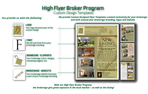
The High Flyer Broker Program for Large Real Estate Brokerages
Participation is FREE!
We are excited to introduce our new High Flyer Broker Program. We created this program to offer highly customized Email Flyer and Print Flyer solutions to larger brokerages of 50 agents or more. As a Broker participating in the High Flyer Broker Program, you will have an account rep dedicated to you individually. The services provided will be totally customized for each brokerage. For your agents a custom program could include product discounts, Special Extras with each order, like PDF’s or Printed Flyers. The program can also include Special Incentives for you, the Broker. We will work directly with you to learn what you feel is most important. From there we will create a unique High Flyer Broker Program just for you and your agents.
Flyers Created Exclusively for Your Brokerage
ZYF’s skilled designers will create a group of flyer templates built around your brokerage’s branding, logo, website, slogan, font … for the exclusive use of your agents. Since your branding is an integral part of the flyer, it means more visibility for your brokerage with each E-Flyer your agents send to the local market, and each Print Flyer in the flyer box. For example:
Visit our High Flyer Broker Program page for more information.
Click here for ZYF to Contact You to Learn More.
For our latest promotions and samples, check our facebook or twitter pages!